What Is The Greatest Scientific Fraud Of All Time?
/Being a fan of scientific fraud and of human depravity generally, I can come up with lots of nominations in this category. If you'd like to be reminded of some of the great ones that you have undoubtedly read about at some time or other, here is a Top Six list from Cracked, and here is a Top Ten list from Listverse. They definitely have some memorable ones, from Jan Hendrik Schon, the rising star at Bell Labs who faked results for some twelve papers published in Science and Nature around the year 2000; to the fake "Tasaday" primitive tribe promoted by a Philippine government minister named Elizalde in the 1970s; to the archeological "discoveries" (planted) of Shinichi Fujimura in Japan in the 1980s; to Ranjit Chandra, who published studies on nutritional allergies of infants, blessing the baby formula products of Nestle and J&J (the studies were never conducted); etc., etc. One of the greatest frauds, making both lists, is the "Piltdown Man" missing link hoax of Charles Dawson in 1912.
But going through these lists also makes clear that none of these frauds comes close to the big one going on right now, which is the world temperature data tampering fraud. This is the fraud by which U.S. government agencies "adjust" temperatures of the past downward in order to make it seem like more recent years are warmer, and thus support the global warming narrative. Now you are going to say, that seems completely ridiculous, they couldn't possibly get away with it, and nobody in their right mind would try such a thing. Well, I'll just give you some evidence, and you decide.
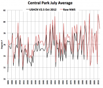
The latest news comes from Joe D'Aleo of the ICECAP website, who reports on a new online tool available from NCDC. That's the National Climatic Data Center of Asheville, NC -- a Federal agency, part of NOAA, in turn part of the Commerce Department. NCDC is headed by Tom Karl, a serious global warming zealot. NOAA has been until recently headed by Jane Lubchenco, another serious global warming zealot. The new tool enables plotting temperature data for cities, states, or regions. So D'Aleo tried plotting the data for New York's Central Park for July, going back to 1885. Meanwhile he happened to know that the National Weather Service (another part of NOAA) had archived data for Central Park for the same time period, so he took the archived NWS data and the new NCDC data and plotted them on the same graph. Result:

Enlarged version. Hmmmm. In the new version, the warm years of the 1930s have magically become cooler, thus making the most recent years much warmer by comparison.
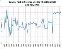
D'Aleo then calculated the differences between the previous raw data and the new adjusted data. Here is that chart:

Enlarged version. Hmmmm again. From 1995 to present, the raw and adjusted temperatures are about the same, but before 1995 the temperatures are "adjusted" downward by between 0.5 and 1.5 deg C all the way back to the beginning of the century. What's going on here? And the amazing thing is, they don't say.
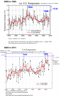
OK, you're thinking, this is some kind of strange anomaly, not a great fraud. Well, you need to get a little deeper into the subject. The main keeper of the official temperature records of the U.S. is a part of NASA called GISS (Goddard Institute for Space Studies), headed for decades by the recently (April 2013) retired James Hansen, another serious global warming zealot. GISS puts out charts of U.S. temperatures plotted on an annual basis. The funny thing is, those charts have changed over time. Here we have the 1999 and 2011 GISS versions of U.S. temperatures:

Enlarged version. In 1999 the 1930s were much warmer than 1998, but by 2011, 1998 had become much warmer than the 1930s. How could that possibly be? Lots and lots of people have noticed this, and have tried to get an explanation, but none is forthcoming.
Meanwhile, is there any significance to this? Well, just to take a small example, in his 2012 State of the Union speech, President Obama, latched on to the recently adjusted NASA data to proclaim:
For the sake of our children and our future, we must do more to combat climate change. Now, it’s true that no single event makes a trend. But the fact is, the 12 hottest years on record have all come in the last 15. Heat waves, droughts, wildfires, floods – all are now more frequent and more intense.
In the speech, Obama specifically cited to the recently adjusted NASA data. You can easily see by looking at the charts that the business of the "12 hottest years on record have all come in the last 15" was completely created by the unexplained NASA adjustments that occurred in 2011. Before the adjustments, many of the hottest years were in the 1930s.
Again, is it just an anomaly or quirk, or is there some kind of systematic fraud going on? A guy named Steven Goddard runs a web site called Real Science. He makes a cottage industry out of keeping track of archived temperature data and reporting on when the government-paid global warming activists adjust the old data downward. Input the word "tampering" into his search function, and you come up with literally dozens of examples where Goddard has identified earlier temperatures being adjusted downward to make the present appear warmer by comparison. The culprits are almost always NCDC and NASA/GISS, although every once in a while the WMO gets in on the act.
The charts at issue here are the very government charts that are used to support efforts to transform our energy economy and reallocate literally trillions of dollars of wealth and income. The allegations of data tampering are not frivolous -- they are supported by clear prima facie evidence. If there were a reasonable explanation, the government should have come out with it a long time ago. As far as I'm concerned, the case for fraud has been proved. There isn't any scientific fraud that I know of that comes remotely close.